4.27.2008

Project Vitra


New book edited by Cornel Windlin and Rolf Fehlbaum (chairman of Vitra), takes a comprehensive look at the company's history and principles and what it stands for today. We thoroughly recommend it. Not only is it great to look at and flip through its also a great read. A chapter that immediately fascinated me was a look at the Vitra headquarters in Basil, where the famous museum can be found. The photography (Paola de Pietri, Olivio Barbieri, Gabriele Basilico and Giovanni Chiaramonte) is effortlessly beautiful and descriptive: showing how the different buildings on the campus relate to one another as well as how they are used.

The book uses a wonderful range of imagery and paper stocks to tell its story, and the typography is faultless. Definitely one for the bookshelf.

4.25.2008

Case Da Abitare


The latest magazine redesign from Milan by Winkreative. Long live the Grot.

4.24.2008

Sputnik Potatoes


These potatoes have been on the top of all the bus stops round Shoreditch for a few years now, but they've recently been refreshed round our way and are really quite an eye-catching spectacle when you find yourself on the top deck of the bus.

4.20.2008

The Bodoni Museum


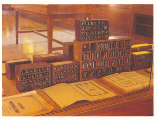
If the food in Parma isn't a good enough reason to come to this fantastic town then the Bodoni Museum should be.

The original matrices, his printing machine, instruments and work are all on display. It was fantastic to see the variations of cuts that he’d made of the famous Bodoni; certain character differences like the ‘g’ little curs on the ‘R’ and one variation with a dot at the end of the serifs.
At some sizes the contrast of thick and thin was closer to Didot than some of the other examples of Bodoni that I’d seen.
He was truly obsessed by the printed letter, he’d made cuts of his famous typeface in Greek, Arabic, Russian and Hebrew amongst others.

4.18.2008

Gray's Anatomy


The images are from the original Gray’s Anatomy and are drawn by H.V.Carter M.D. There is something about these beautiful engravings that leaves its more modern 3D-rendered bethren wanting. 150 years after it first came out, Gray's is still considered a bible in the world of medicine.

While its original author, Henry Gray, has been immortalised, the name of its illustrator, Henry Vandyke Carter, has largely been forgotten. This could well be due to the fact that the current 40th edition no longer retains any of Gray's text or Carter's drawings.

4.14.2008

Dick Sawyer in Nova


I saw these illustrations by Dick Sawyer in the May 1965 edition of Nova magazine and they just seemed very apt for the time.

4.10.2008

EDO American Night Part 2


The second speaker at the EDO's American Night was given by Janet Froelich, who awed us all with the glamour and style of lush photoshoots, film and all the aims you have when creating a new magazine from scratch with a budget we can only dream of. The process from start to finish was like a hollywood blockbuster with a cast of A-list names. As Janet herself said (which we managed to scribble down next to the hot dog sausage comment) in order to do her job, all you need to do is employ brilliant people, which indeed she has done. It was a rare insight into how a project of that scale comes together right from the initial work of creating typefaces, defining the logo, art directing photography, to achieving a conversation between type and image on the page. To hear so much detail and see first hand how much thought goes into the whole enterprise was a brilliant insight into an amazing world.

Read other reviews of the talk from:
Mark Porter
Michael Surtees

A brilliant first offering from the EDO. With more talks planned from Neville Brody and British Vogue Creative Director, Robin Derrik on the cards, we can only point out what great value for money the membership is.

EDO American Night Part 1


A really, really splendid talk last night. A perfect pair of speakers. First we were treated to the workings behind the illustrious self-confessed type geeks, Jonathan Hoefler and Tobias Frere-Jones. All those questions about how you start a typeface, why you design a certain font, where your inspiration comes from and why on earth you end up creating 80 varients of one font were all answered last night. Here at Things to Look at, we tried to capture in writing all the amazing phrases that came out last night, but listening seemed to take over the writing and so at the end when we surveyed our shameful scrap of paper we found we'd only written a half garbled sentence about the creation of a dollar sign that resembled a hot dog sausage. We can only recommend that if you have a genuine interest in type conservation and restoration, a love of four point type, tricky tables and the perplexing problems of agate fonts, that you really make it your mission to hear Jonathan talk. It was a superb talk, really superb.

More on the second speaker soon...

4.09.2008

Richard Avedon in Milan


Last weekend I was lucky enough to be taken to an exhibition of Richard Avedon’s portraits and a small selection of his fashion shoots from his years of collaboration with Harper's Bazaar.
We here at Things To Look at were already infatuated with Avedon’s work, but that was only through reproductions seen in books and magazines.
The first thing we were struck by was the size of the prints. His most famous fashion shoot with the elephants measures at over 1.5 metres; the American portraits were maybe a little smaller at 1 metre.
It was great to see the images at these sizes, nothing could be hidden not even the retouching. It was really reassuring to know that not all his images were perfect from the moment he clicked the shutter.
To see some of the original prints from the 30’s now yellowed by time was also really special.
The exhibition goes on till June 8.

4.04.2008

New York Magazine


Some recent New York covers and in contrast, some much older covers and inside spreads from the sixties.


4.03.2008

Are you in the EDO?


If you haven't already heard about the new Editorial Design Organisation, then maybe now is a good reason to sign up. The EDO is a not-for-profit body administered by editorial designers for editorial designers. It sets out to do three things:

• To promote and develop the skill, knowledge and appreciation of editorial design in magazines, newspapers and websites.

• To inform and generate debate among professionals working within the industry.

• To inspire and encourage students and young professionals entering the field.

Plus for £40 a year, you get to go to all their events for free. Next Wednesday, Janet Froelich, Creative Director of The New York Times and of T: The New York Times Style Magazine joins typographer Jonathan Hoefler in their American Night held at The London College of Fashion.