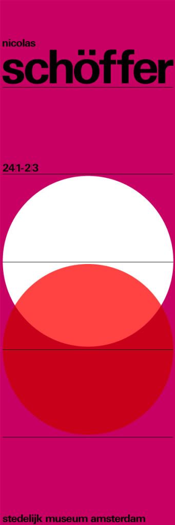
6.15.2011

P/M Magazine


A Design Student's Guide to The New York World's Fair
1939
Paul Rand

We here at things to look at are always in favour of bold, pure geometry and this just caught our eye.

5.09.2011

Festival Times


The Festival Times
4 Issues from 1981
Edinburgh University Student Publishing Company
Designers: Simon Esterson & Nigel Billen
Editor: Tim Willis

Anyone who attended Simon Esterson's Typographic Circle talk last month might remember seeing this early piece of work. There is something very exciting about the angled headers and images.


5.06.2011

Dennis Bailey


Dennis Bailey designed this contents page in 1963 for Olympia magazine

5.03.2011

Varoom 15

The lastest issue of Varoom Magazine is out which is full of things we liked the look of.


Airside's illustrations for How To Make a How To Film. The animated versions are well worth checking out on the website.


Penguin's new editions of Nabakov featuring illustrators such as Luke Best, commissioned by Pentagram. It's a great contemporary angle on the very successful Poetry series patterns of the past.


Above: Illustrations by Astrid Chesney and ]Agnès Decourchelle. See more of these on Pentagrams website

It's quite interesting to compare them with the John Gall Nabakov covers, all of which you can see on Design Observer.


And of course, Marian Bantjes' map of an Isle of Knowledge charting all the ups and downs of the illustrator's world is beautifully rendered. The delta of common sense is not somewhere I hang out a lot and the swamp of failure seems to be ominously large.


There are more details on Marian Bantjes' website. They're well worth some scrutiny.

4.14.2011

Wim Crouwel


Wim Crouwel; design hero. Even if you think you've seen it all before, the Design Museum have really come up trumps with their exhibition: Wim Crouwel: A Graphic Odyssey on from 30 March – 03 July. You can't help but be impressed by a huge wall of the posters we've all seen. It's an epic collection beautifully laid out. We here at Things to Look at particularly appreciated this poster.


4.03.2011

Stilla: The Greatest Numerals


According to Herb Lubalin in the 1975 Second edition of U&lc (Upper and Lowercase magazine), which can now be downloaded as great hi res PDFs from the fonts.com blog. They're up to six issues in what must be a time-consuming endeavor. It's such a great idea and I hope they continue to upload what was a great example of Herb Lubalin's love of typography and contains many gems that don't feature in the book.


The numerals are shown in Stilla, designed by French type designer, François Boltana in 1973. A perfect example of the 'Fat Face' type style. The commercial face differs slightly from the above version which surely must have been hand drawn by Lubalin.

3.03.2011

PORT : Could this be the modern man?


What do all those men not buying existing magazines want in a magazine that isn't offered in one publication? PORT could just have the answer. Behold the 'modern man' in bold spreads, with pensive words and amazing photographs. Check out the video on the website to see the all-star content.


2.05.2011

Flipboard on the iPad


In order to acknowledge modern technology, Things to look at have set up a sparse Twitter account in order that people can import the feed into their Flipboard on the iPad should they so wish. Here's what it looks like.

2.03.2011

Helmut Krone


Designer: Helmut Krone
Photographer: Bert Stern
Process: Letterpress
Typeface: Century
Compositor: Typographic Craftsman, Inc.
Engraver: Walker Engraving Corp.
Client: Polaroid Corp.


Agency: Doyle Dane Bernbach, Inc.
Art director: Helmut Krone
Copywriter: Robert Levenson
Photographer: Bill King
Client: Ohrbach's

The great Doyle Dane Bernbach art director Helmut Krone, (July 16, 1925 – April 12, 1996), mostly known for the 1960s Volkswagen Beetle work. Here are a few things that caught our eye. There is a book about his work, examples of his work on the AIGA website and information about his life and work on Design Observer.

1.03.2011

From The Archive


A random book cover we like the look of due to the very ornate typeface used to represent conflict

Fictional Book Covers

There was a trend last year in creating fictional retro book covers for films and video games. It's a very satisfying project. We hate to leave people uncredited which is why this post never made it up on the blog. If anyone knows who did the bottom three covers then please let us know as we think they are great and would love to link to that person's site.

No More Drugs for that Man This Means Something. This is Important. I'm not in the business... I *am* the business.

The above are from Spacesick

Colour Theory


There is so much to say about colour theory, that we just won't say it. If you throw all that aside and boil it down to its simplest level, then we can all agree that their is something very fulfilling in explaining a complex idea through the placement of a few humble shapes.