12.31.2007

The Power of The Circle

CIR_07.jpg
CIR_01.jpg
CIR_09.jpg
CIR_08.jpg

There is something very satisfying the the purity of the humble circle which book covers over the years have made full use of. To see more book covers like those shown below then these two blogs are a great resource.

http://seenbooks.blogspot.com/
http://acejet170.typepad.com/
http://www.flickr.com/photos/joekral/sets/72157594264351021/
COV_01.jpg
CIR_05.jpg

12.20.2007

Just Type

AA_009.jpg
AA_008.jpg

After looking at these recent covers at the Architectural magazine exhibition, we started to think about the strengths and weaknesses of the all type cover. Here are some we like the look of below.

BM_01.jpg
BM_02.jpg

12.13.2007

Architectural Magazines

AA_01.jpg
AA_02.jpg
AA_12.jpg
AA_05.jpg
AA_04.jpg
AA_07.jpg
The Radical Architecture of Little Magazines in the 60's and 70's is a showcase of 70 magazines, which ended at The Architectural Association in London this week. We went on the last day and were very impressed. For those that missed it, the website has a brilliant timeline section. Above is a slideshow of our visit. (thanks to the marvellous Grainedit blog for the technology tip. Below is the free poster which they gave out for free.
AA_16.jpg

Here are some of our favourite things to look at from the show. See more on Flickr
AA_13.jpg

The Believer


Anyone familiar with the publishing house McSweeney’s may have read their excellent magazine The Believer. Primarily a magazine about literature it also contains an eclectic mix of art, music, film and politics, all brought together in a rather beautiful little package.

The visual approach was originally developed by author, designer and McSweeney’s founder Dave Eggers. The text heavy content is typeset in a mixture of centred and fully justified text and framed by heavy page borders. This conservative appearance is jarred by the magazine’s playful tone of voice, the ample use of intriguing illustrations (provided by Tony Millionaire and a different guest illustrator each month) and the eccentric covers which are a visual delight.
The covers are formed from a grid of 9 squares with wordy headlines sized to fit, decorative flourishes, varying colour schemes and illustrations by the great comic book artist Charles Burns. Despite this rigid system it still manages to look fresh every month.

In many ways The Believer could be seen as The New Yorker’s rebellious little cousin.

12.11.2007

Editorial Design Organisation

1965_ES.jpg
Last night marked the grand opening of The EDO (Editorial Design Organisation), created to promote and develop the skill, knowledge and appreciation of editorial design in magazines, newspapers and websites. Join up and you get to go to some great talks. On the menu for next year are Robin Derrick: Creative Director of British Vogue, Janet Froelich: Creative Director of The New York Times and the mighty Jonathan Hoefler.

The best parts of last night were:

1: The view. IPC Media's rooftop wintergarden is a great place to behold.
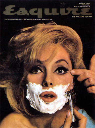
2: The Auction. My favourites were the March 1965 Esquire and a copy of Nova.
3: The quiz. Although we lost terribly.

If you're interested in joining then it's well worth it, especially if you're a student interested in magazines and newspapers. It seems to be a great way to learn from some top people and get to put a few faces to magazines.

12.06.2007

A Bold Use of Blackletter

NYT_01.jpg
NYT_02.jpg
FR_02.jpg
FR_01.jpg
Poor old Blackletter has had it rough over the years. Beloved of the Third Reich over sans serif faces which were associated with cultural Bolshevism, ye olde Blackletter has found it hard to break back into fashion and prove its legibility. Even today, this Germanic font is still used to connote tradition and seriousness, mostly found on Newspaper mastheads. This is much the same as the Modern typeface family and its associations with elite fashion brands.

But it seems blackletter is shaking off some of that old legacy. Matthew Carter was recently asked to draw a blackleter typeface for the New York Times, based on their Blackletter monograph. The new style magazine has made the bold move to re-employ this aged typeface as a display font and the results are really interesting. The new website's 'words' category is a great display case for this new usage. For those of us who don't have access to Matthew's font then you might try another blackletter revival face: Fette Fraktur shown above. Sometimes I forget how great they are. The lowercase F being my favourite.

12.04.2007

Five Things You Always Wanted to Ask Matthew Carter


1. Did you really enjoy designing fonts for Microsoft?
2. Do you get annoyed when people "mess around" with your fonts?
3. How do you become a serious typographer?
4. What letter of the alphabet do you design first?
5. Where do you get your inspiration for fonts from?

If you had attended the lecture at the RSA last night, you would now know these things. Brilliant.

12.02.2007

From Random Travels


Spar supermarket pins from Lisbon, Portugal
Tesla Electronics pins from Prague, the Czech Republic
Chairman Mao pins from the People's Republic of China

11.28.2007

Creative Review


Any one who’s familiar with Creative Review knows that something very interesting is happening with its magazine. Editor Patrick Burgoyne and his team are constantly coming up with really exciting features, and ideas to engage with its audience. Features range from short pieces and caption stories to really interesting longer pieces that actually explore topics that are being discussed in design studios and blogs around the world.
This month’s main feature talks to some of the key people who shape the Tate’s brand. There is a monthly diary from Will Gompertz, Cornel Windlin talks about the brilliant Tate etc. magazine, as well as other key players who offer an insight on how such a big organisation runs its public image.

11.27.2007

Forgotten Arts


A little retrospective of calligraphy through the ages with particular emphasis on the elegant appeal of the decadent swash, care of Francesco Moro c.1560-70, Giulantonio Hercolani 1574, the mighty George Bickman's Universal Penman 1741, and the modern day John Stevens. All this plus many many, more examples to be found in St. Brides library off Fleet Street which has a great late night opening on a Wednesday night until 9pm.

11.24.2007

Monocle


We here at things to look at have been keeping an eye on Monocle and to be honest, we can’t help but be impressed. Tyler Brûlé and his design team must be commended on creating a magazine that can’t be ignored. Of course it’s not to everyone’s taste but its very clear and direct about what it stands for. Its a different magazine from the Brûlé Wallpaper* years, but it has taken a part of what made wallpaper* so interesting for me in the first place, its mix of soft politics and economics with a combination of fashion and design.
As a publisher you can see how passionate Brûlé is about magazines, he is also very much aware of the power of the web. Its website has been incredibly well designed, and editorially its very smart with its mixture of videos and extra non published material.

11.21.2007

St. Brides Re-invigorates


So a great start to what St. brides terms its re-invigoration plan. The demonstrations by Caroline Webb of stone carving and Douglas Bevans of Bookbinding were really interesting. It was just a shame that Paul Antonio was ill, so instead there was a 'who can do callingraphy the best' competition. The Things to Look at team are hopeful entrants in this nerve-wracking affair. If there should happen to be another such evening as this, then we thoroughly recommend a visit, if not just to see the new reading room alone, which sadly lacks the grandeur of its predecessor but is full to the brim with typographic gems.

St Brides


Tonight St Brides are doing demonstrations of letterpress printing, stone carving, calligraphy and bookbinding. Paul Antonio will be there showing us all how we really should have learned to write. If you're interested in attending click on the title of this post. More pictures tomorrow perhaps.

11.12.2007

Tom Ford For Men


Tom Ford's collaboration with Terry Richardson has produced these new ads for his men's fragrance.
I'm so blown away by its bravery that I don't know whether I like them or not. I wonder what we will think of the campaign over time, will we think its provocative and ground breaking in a Helmut Newton/ Guy Bourdin way or has it stepped over the mark and gone into tacky territory? At the moment I just cant decide.