2.24.2009

Parr for Vuitton


It’s been a while since we put up a fashion photograph on Things To Look At, no better way to kick start it than with Martin Parr’s images for Louis Vuitton I think. This work is particularly interesting, not only based on how good it looks but because there’s definitely an effort here to do something different. Its unusual because its fashion reportage – distinctly different from the posed glossy campaigns from years past. Its an interesting commission on Vuitton’s part to work with Parr, famous for his modern photo documentary style. The images have an easy elegance, it all seems unforced and seamlessly casual. The crops and focused shots on detail are almost movie like, which is further enforced by an apparent narrative. He’s on holiday (the bag), meeting with friends then off to a party in the evening (ok its not an Oscar, but at least there’s a story). Not quite sure how many times I’ve seen fashion campaigns work with the idea of a narrative in this way – I wish it’d happen more.


2.20.2009

Designs of the Year 2009


Just in case you haven't seen the pictures already posted here and here, here, we thought we'd show you some more! Other interesting entries we like the look of are:


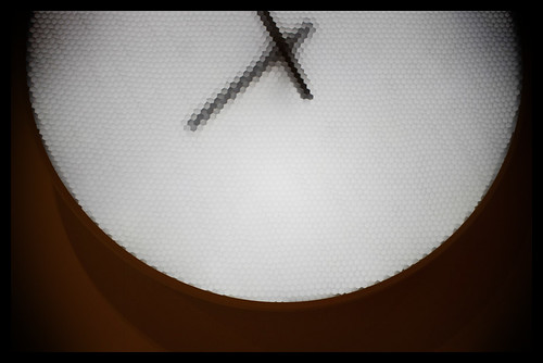
The Pixel Clock
It's quite captivating to look at but will it be enough to win?


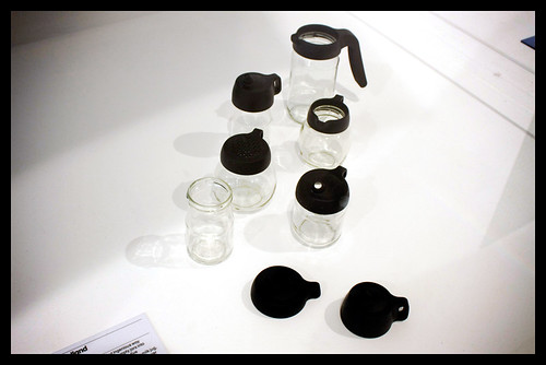
The Jar Tops
Not only is this stylish and beautigul it always wins for just being a great idea.


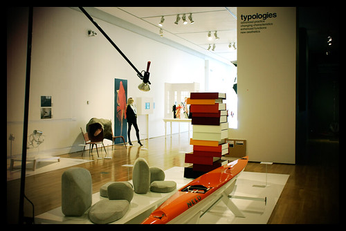
The Flyak
I am not sure if it's very practical but it is very long, very thin and very orange.


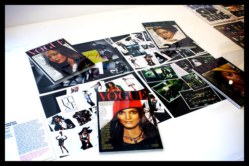
Italian Vogue
It's always good to have a magazine or two in the running.


All the Time in the World
Another moving piece. The transition between the numbers and letters is very hyponotic.


Job Wouters (Letman)
There are so many other interesting entries, the Wall Appeal, The Wooden Radio, The Jan Bons book. Well worth a visit to see such a varied range of designs.

2.19.2009

Designs of the Year

The Designs of the Year exhibition opened at The Design Museum this week. One of our favourite entries is the credit crunch diagrams designed by Guardian design team, lead by Michael Robinson

"Geometric shapes of proportional sizes show the value of objects past and present or convey the undulating markets in a simple yet clear way. The design team lead by Michael Robinson at the Guardian have consistently covered the financial news using this approach in order to make the information more accessible to a broad readership and convey the information without too much confusion whilst avoiding business terminology.”


Let's just have a closer look at these amazingly well thought out infographics. Click each picture to see the entire news page it came from.


2.11.2009

EDO Party 2009


A new year heralds year two of the newly founded Editorial Design Organisation. Last year we here at Things to Look at saw some iconic people talk about editorial design: Janet Frolich spoke about being the art director of The New York Times and T magazine. Jonathan Hoefler spoke about designing fonts for a plethora of publications ranging from Martha Stewart's Living to The Wall Street Journal. And Robin Derrick took us through 25 years at Vogue. Just some of the talks and debates on offer.

All in all the organisation is a great resource for everyone interested in editorial design from students to professionals. This was fully represented in the turnout at the party last week. Students met and talked with designers and art directors from publications such as Wallpaper, Eye, Creative Review, Case da Abitare plus many more. There was even an exhibition of work people gathered together by attendees which they considered represented the best work from 2008. Work by Studio 8 and Wired featured very prominently on the walls which was interesting.

All in all, a great start to what hopefully will carry on growing year after year. Here are some bits and bobs from the display. If you would like to join up and potentially see Scott Dadich, creative director of Wired magazine talk, sign up via the website.