4.14.2011

Wim Crouwel


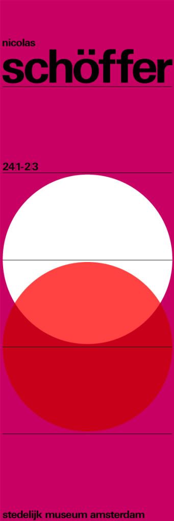
Wim Crouwel; design hero. Even if you think you've seen it all before, the Design Museum have really come up trumps with their exhibition: Wim Crouwel: A Graphic Odyssey on from 30 March – 03 July. You can't help but be impressed by a huge wall of the posters we've all seen. It's an epic collection beautifully laid out. We here at Things to Look at particularly appreciated this poster.


4.03.2011

Stilla: The Greatest Numerals


According to Herb Lubalin in the 1975 Second edition of U&lc (Upper and Lowercase magazine), which can now be downloaded as great hi res PDFs from the fonts.com blog. They're up to six issues in what must be a time-consuming endeavor. It's such a great idea and I hope they continue to upload what was a great example of Herb Lubalin's love of typography and contains many gems that don't feature in the book.


The numerals are shown in Stilla, designed by French type designer, François Boltana in 1973. A perfect example of the 'Fat Face' type style. The commercial face differs slightly from the above version which surely must have been hand drawn by Lubalin.