10.21.2007

Piet Zwart


Everyone has to start somewhere. Along the line some decision towards design has to manifest itself. Maybe it's due to your beloved New Order record covers, a logo you see everyday or a book you happen across. For me it was one afternoon looking through a book on Piet Zwart whilst in the middle of a life drawing lesson. 'Yes.' I thought 'That's exactly what I'd like to do'. Here are five things of his to look at. Who other than the mighty Mr Zwart could make a cable factory look this stylish?
10.13.2007

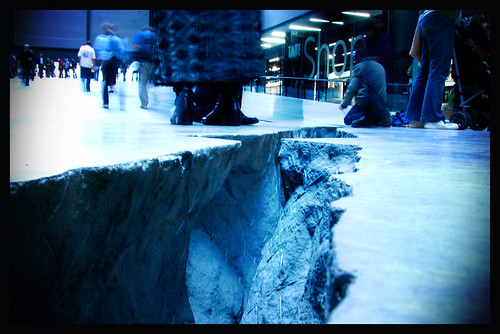
Doris Salcedo


Exhibition: Doris Salcedo Shibboleth
Location: Tate Modern
Dates: 9th October - 6th April

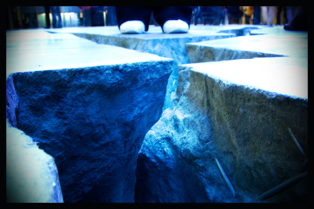
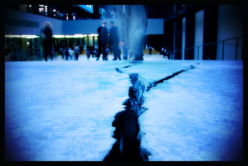
The new crack in the Turbine Hall is a strange sight indeed. It starts as a hairline fissure from the door as you enter amd ends at the very end of the hall after winding its way in a giant zig zag across the space. The mystery of how this was done leaves many people on hands and knees peering into the gap. I expect by the end of the week they'll be hoovering small children out of it. Brilliant. How do we think it was made? I personally go for the act of god/wizard option, but it's well worth seeing it for yourself and having a think.

10.04.2007

Vogue vs. Bazaar


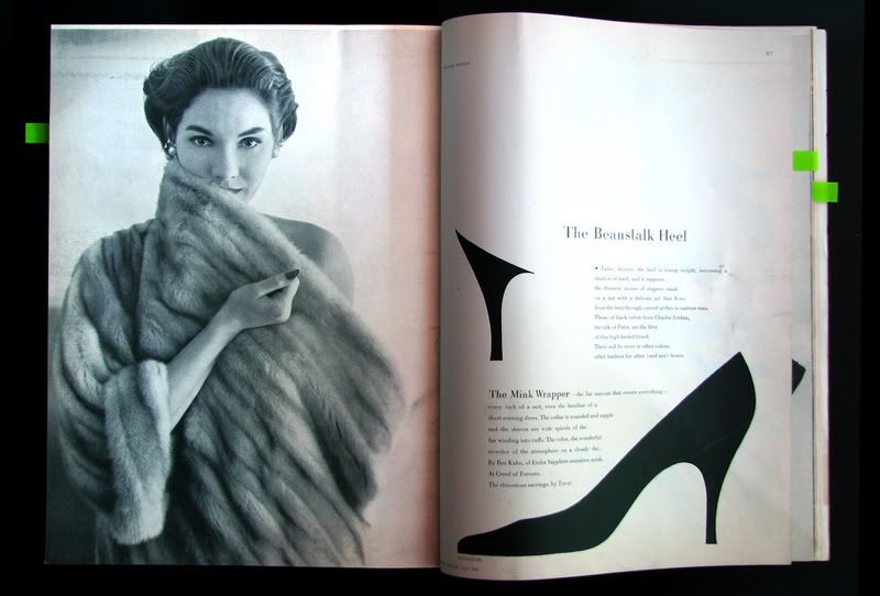
American Vogue December 1950 & American Bazaar July 1952 as featured in the Eye 65 article by Abbot Miller on Fashion Typography

10.03.2007

Museums Journal


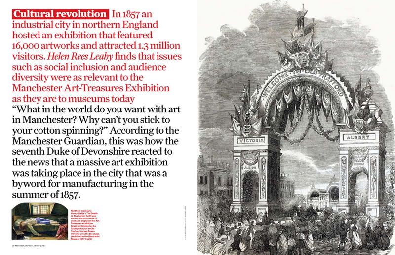
The latest studio output: Museum's Journal published by The Museums Association. Christian Shwartz redrew the logo and created the Haas typeface; based on the original drawings of Helvetica. This is another example of 'Multiple image cover usage' as discussed by Jeremy Leslie and Search and Destroy.