12.11.2009

I.D. Magazine


Editor in Chief: Jesse Ashlock
Art Director: Jeffery Docherty

I.D. is an American based design magazine. Its features cover profiles of designers, design entrepreneurs, latest gadgets, inventions architecture etc. Its been around for a good while, but its latest rendition hasn't failed to impress us time and time again.


Firstly what a gorgeous font. A stencil serif font thats not obtrusive or loud and so contemporary.
The design and layout is really understated, never at risk of being bland because of all the expertly crafted bits of detailing. The captions, arrows, rules (usually the least interesting in other magazines) have been treated with a great deal of care here. Nothing has been overlooked.


Editorially its also really enjoyable - writing about design with a real sense of industry and scale but always with a youthful vigor.
Photographically, its all very clean and consistent..... always spontaneous and light. My favorites are the still life shots, lit beautifully and shot on colored backgrounds - what could be more simple...

These images are of a special Design+Business June 2009 issue where they used one of our favorite magazine tricks - the old paper stock change... never fails to impress when used properly, this case is no exception.

12.09.2009

Seen on the Web


I know it's a bit of a cop out reshowing things that are already online, but here at Things to Look at, we thought these simple geometric covers of this 50's Canadian-Latvian literature magazine, Jauna Gaita, were too good not to show. See many many more on Mikus Vanags' flickr page. It's a really great set.

12.07.2009

Inside Typography Workshop


Alan Kitching is a private man. It's not often that you get to see inside his workshop. This is mostly because he's busy and you would only just get in the way, but it only seems to make us all more desperate to see what goes on; to find out how he puts together his complex letterpress work and to delve into his collection of wood type.

Typography Workshop began 1989 with a Stephenson Blake proofing press and some type all purchased from Derek Birdsall's Omnific.

Later there were two closing print-shop auctions, plus Herbert Spencer's press and collection of wood-letter, but it was the acquisition of theatrical poster wood block letters from the small village of Wrington that really made an impact. No one would think that you could manage to fit an enormous barnload of type into his workshop, but it's there, it's huge and it's an amazing sight to behold.

Eye74 (out next week) has an article telling you all about the history of the workshop, but Alan is also doing a rare talk this week. If you have ever wished you could dive into Alan's workshop, see where he gets his ideas from and see his actual working process as he juggles wood type half a metre high, then this is a talk for you. Just look at the massive W below.


It takes place in a gallery called Advanced Graphics in Borough, south London, which is currently exhibiting his work. There's some amazing work on show so it's well worth a visit just to look at it all.

It's £25 though, which is not cheap and there are only a limited number of tickets as it's an intimate do. But if you love letterpress and have ever wanted to meet a legend, then like me, you'll be there this Thursday 10th December. You just have to call Eye on 0845 456 7757 to buy a ticket. Below are some photos taken by Phil Sayer illustrating some of the process Mr K. goes through.


Read more on the Eye blog.

11.20.2009

Chicken magazine


The cover of the Journal of British Chicken Association from May-June 1963 was printed black on red, and only about A5 size. I think it looks quite striking especially considering the subject matter!

11.14.2009

Sunday Times

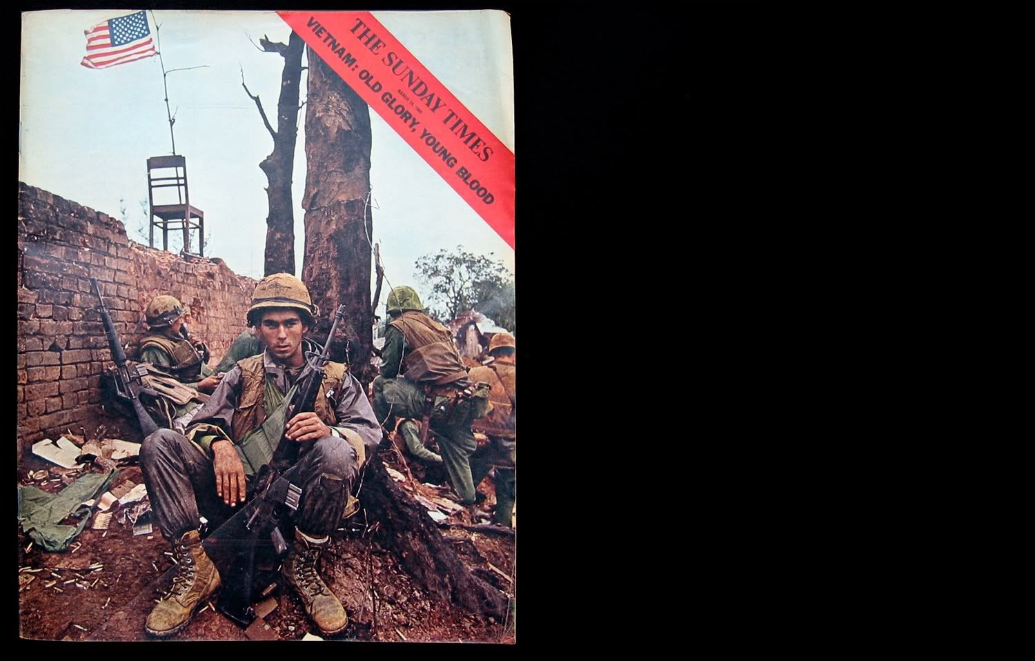
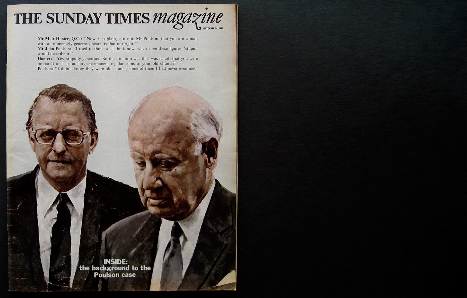
Below are a selection of covers and spreads from The Sunday Times Magazine. The most famous being Don McCullin's Viet Cong piece. Rick Poynor writes about The devaluation of photography in magazines in EYE74 stating that it just isn't what it used to be. This is also mirrored in the recent New York Times piece which talks about war photography then and now. I think the below pages illustrate a time when imagery thrived.


11.06.2009

Eureka Magazine


Yesterday saw the unveiling of the second issue of Eureka, the new Times monthly supplement about science.

The Design team consists of art direction by Matt Curtis, information graphics by Matt Swift and design by David Loewe brought over specially from Berlin. The issues have also featured cracking illustrations from the likes of MASA, Robert Hanson and Raymond Biesinger.

There are more pictures over at Mag Culture. Here are some below.


Jeremy compares it to a less dense version of Wired which I would agree with. It seems to us here at Things to Look at that with these publications innovative information design is key in conveying content and injecting humour into the subject matter. American magazine Good could also be slotted into this genre of magazine. The sheer time it must take to visualise all this data is impressive.

One imagines a huge team behind each issue, yet it's a nine-strong team of editor, art director, picture editor, chief sub, information graphics designer, designer, plus 2 additional subs and a researcher. It looks like it's a lot of fun to work on.

Here are a few images of Good Magazine to see how other information design led magazines do it.


10.06.2009

Geigy Heute


A gem of 1958 diagram design, Geigy Heute (Geigy Today) designed by Karl Gerstner 1958 as featured in the recent publication from Lars Muller +Museum fur Gestaltung Zurich, titled "Corporate Diversity: Swiss Graphic Design and Advertising by Geigy"