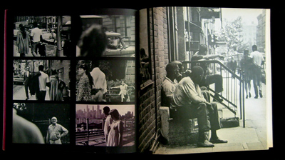
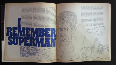
Book. Twen. Revision einer Legende.
Author. Michael Koetzle
Principle Designer. Willy Fleckhaus
Publisher: Prestel
ISBN: 3791380826
New addition. The book list at the right hand side of the screen. Kuchar and I thought it a good idea to share the wealth. From time to time we get a really good book and feel it right to share with the world. Not just an 'alright' book, or a 'good', but something we consider a 'must have'. Obviously this is merely our own illeducated point of view.
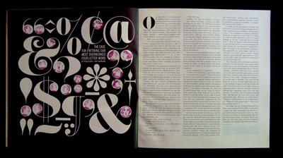
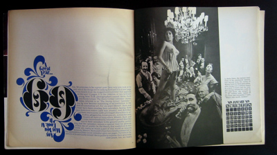
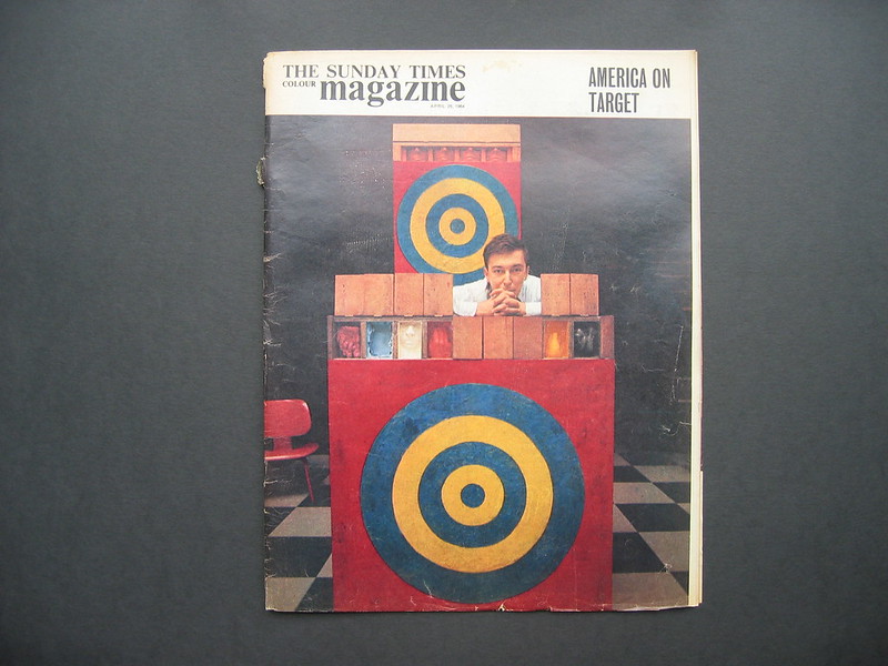
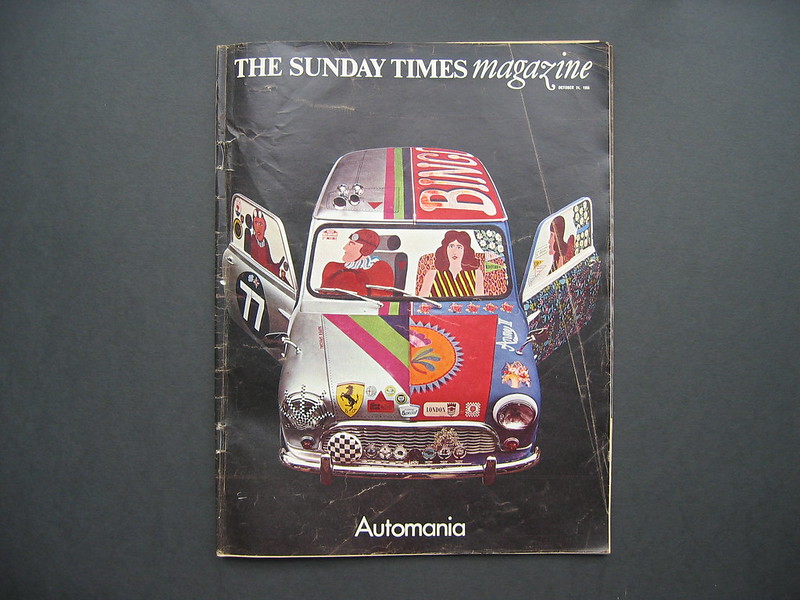
The mighty Twen, by the mighty Willy. To find out more about Mr Fleckhaus read eye 3 vol 1.
The reason I was thinking about our Willy was that I saw in Magma they are selling a series of 'famous designer' grid notebooks. It's a bit too expensive, but you do get Willy's authentic twelve-unit grid on the same 265 x 335mm page size. They also do one for Jan, Josef, Paul and Charles-Edouard. Have a look on
Magma and see if you're geeky enough to get one. Who knows you could suddenly reel out covers like the above.