
Poor old Blackletter has had it rough over the years. Beloved of the Third Reich over sans serif faces which were associated with cultural Bolshevism, ye olde Blackletter has found it hard to break back into fashion and prove its legibility. Even today, this Germanic font is still used to connote tradition and seriousness, mostly found on Newspaper mastheads. This is much the same as the Modern typeface family and its associations with elite fashion brands.
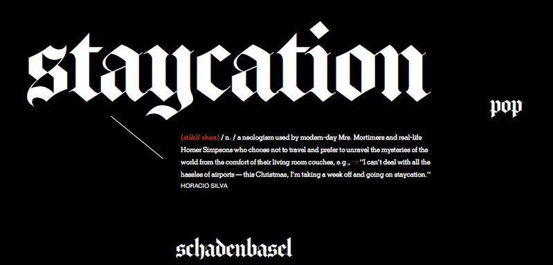
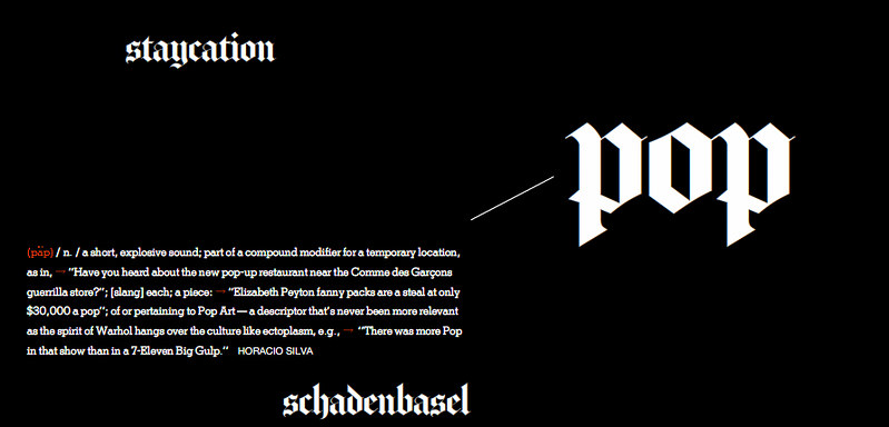
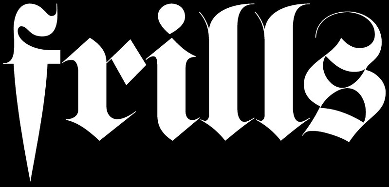
But it seems blackletter is shaking off some of that old legacy. Matthew Carter was recently asked to draw a blackleter typeface for the New York Times, based on their Blackletter monograph. The new style magazine has made the bold move to re-employ this aged typeface as a display font and the results are really interesting. The new website's 'words' category is a great display case for this new usage. For those of us who don't have access to Matthew's font then you might try another blackletter revival face: Fette Fraktur shown above. Sometimes I forget how great they are. The lowercase F being my favourite.
2 comments:
"Beloved of the Third Reich over sans serif faces which were associated with cultural Bolshevism"
Hi,
That's a popular myth, actually the opposite is true: the nazis dismissed blackletter as being of 'jewish origins', in 1941 its use was officially abolished in favour of latin type.
Regards, Daniel
I can't get enough of this font. Maybe because its cold and I am drinking my share of Jagermeister which uses the same font, but there is something comforting about it.
There is even the Black Letter Law which is the practice of setting all lawbooks and other legal documents in blackletter typeface.
Post a Comment