

Client: Vitra
Design & Art Direction: Cornel Windlin
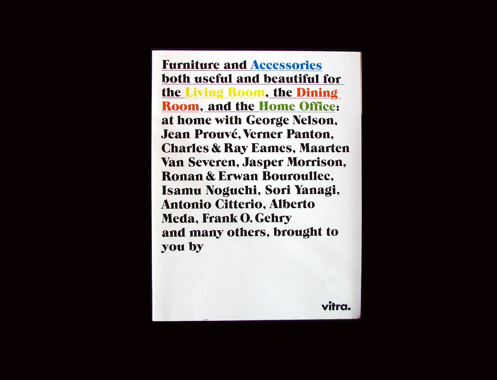
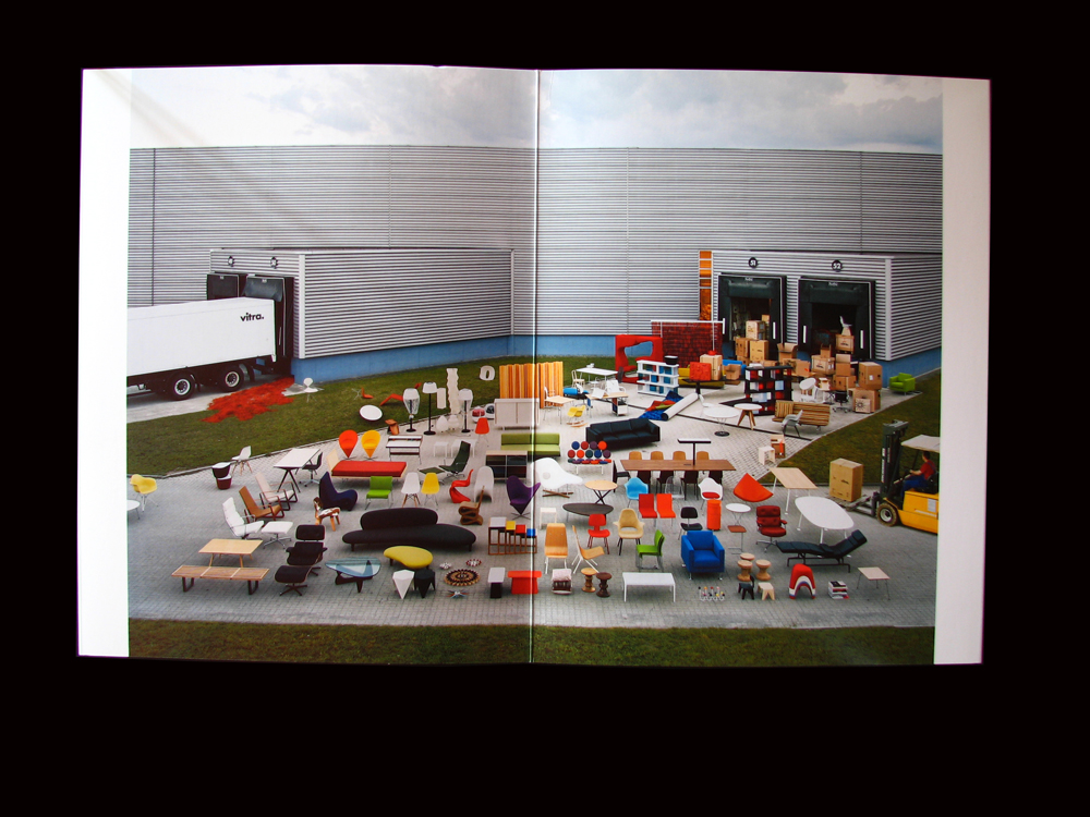
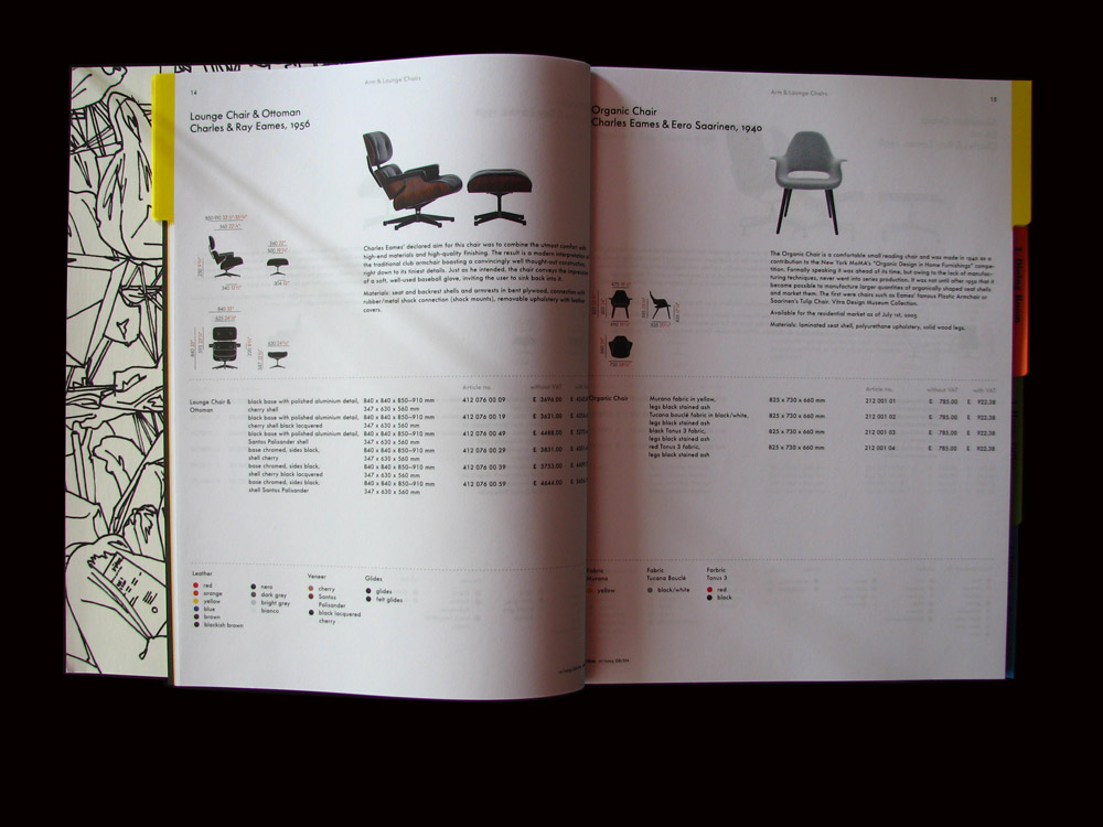
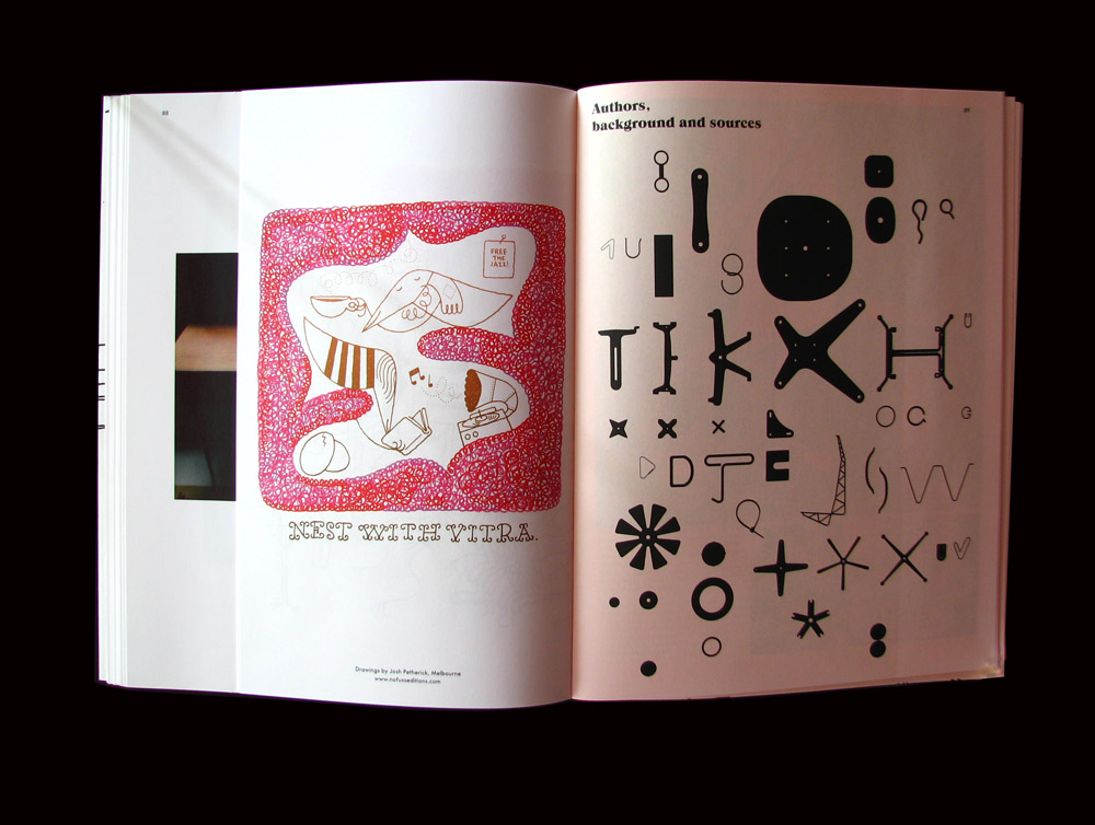
For any of you who missed the hype, Cornel Windlin gave new meaning to what catalogues could be in 2005. I could give you a full description of how fantastically inventive it is and its significance to the genre, but Rick Poynor has already done that in issue 56 of eye magazine.
3 comments:
Great post, hadn't seen this. Really like Windlin's work, has a kind of playful and light quality and his spreads never settle for being comfortable at the expense of interesting (I'm most familiar with Tate magazine)
What's the cover typeface? Has a lovely g. I'd have had some sleepless nights over where to have a line break in the final sentence though...
I think he's great as well. He has a font foundry:
www.lineto.com
Not sure what the font is though, wouldn't surprise me if he made it specially for Vitra.
Its interesting, I think the way it ends is a typical Windlin thing, seamlesly ignorant of all the rules.
Simon, the cover typeface is ITC Grouch, a 70’s and 1 style only font designed by Tom Carnase.
Post a Comment