Just in case you haven't seen the pictures already posted here and here, here, we thought we'd show you some more! Other interesting entries we like the look of are:

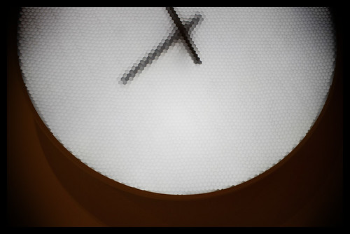
The Pixel Clock
It's quite captivating to look at but will it be enough to win?

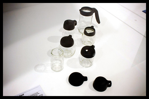
The Jar Tops
Not only is this stylish and beautigul it always wins for just being a great idea.

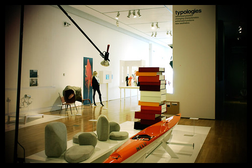
The Flyak
I am not sure if it's very practical but it is very long, very thin and very orange.

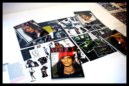
Italian Vogue
It's always good to have a magazine or two in the running.

All the Time in the World
Another moving piece. The transition between the numbers and letters is very hyponotic.

Job Wouters (Letman)
There are so many other interesting entries, the Wall Appeal, The Wooden Radio, The Jan Bons book. Well worth a visit to see such a varied range of designs.
5 comments:
Very interesting pictures. :D
Great designs. I really hate advertisements, but I have to admit that commercial art is one of the most creative artistic fields today. I guess when one's livelihood depends on grabbing the attention of potential customers and meeting deadlines, imagination has to kick in at full speed.
Having black for the jar tops is totally new and a good idea
Post a Comment