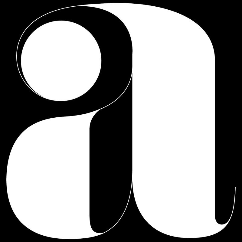
Following on from our Lou Dorfsman post, someone asked what font the 'ha ha ha' was in. See the lower case 'a' above. Well this is a mystery to us here at 'Things to Look at'. Did he redraw it specially to work at that size? It seems likely that the extreme contrast between thick and thin lines would disintegrate at smaller sizes making specific size versions a must. We know that he created CBS Didot and CBS Sans and we are aware he was a fastidious man making it seem highly likely that this is a one off hand drawn letter.
Could it be an existing font? A lost font perhaps? Or is there some other explanation? If anyone knows the answer then it would be very interesting to know. All we can work out is that is none of the usual 'modern' suspects shown below, especially as many of them post date the poster which was created in 1961.

5 comments:
Pretty sure that it is custom drawn. I have seen it in one of my old copies of Graphis magazine. It is featured in an advert designed by Herb Lubalin for a type design competition. Will try to find out more and let you know.
Found this on a site featuring some of Lubalin's work.
http://www.typogabor.com/herb-lubalin/pages/herb_lubalin_039.html
Jonathan that site is excellent. Yes, I think it's most probable that the A was handdrawn.
I believe it's Pistilli Roman. Unfortunately it has never been turned into a digital typeface due to it's extreme thicks and thins. I did a crazy search for this for some time and the information on it is minimal.
Hi, I also wanted to show you these images that I found of Pistilli Roman
http://www.fayeandco.com/download/20936.gif
and
http://www.fayeandco.com/download/26Reasons.jpg
They are beautiful examples!!!!
Post a Comment